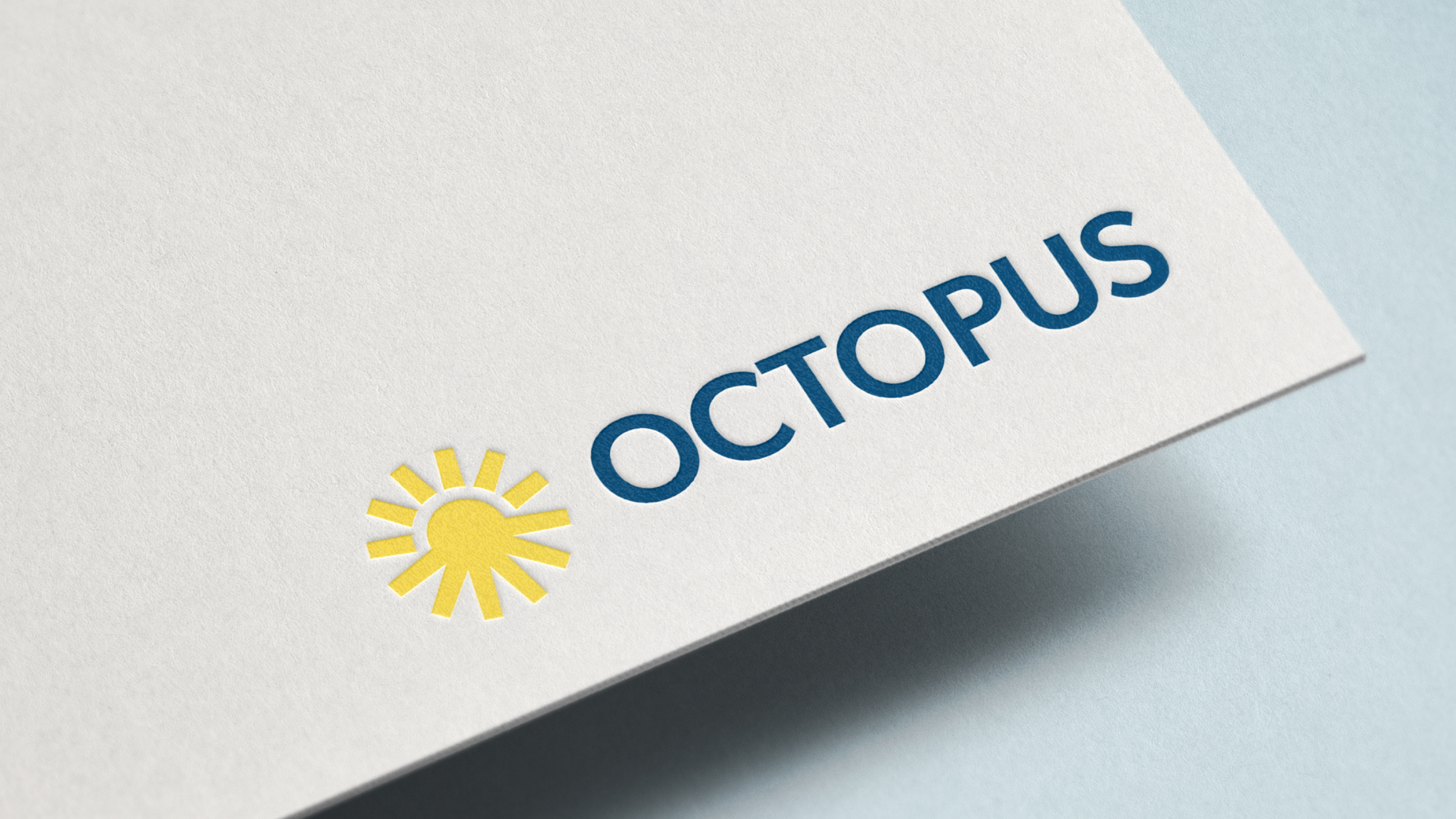
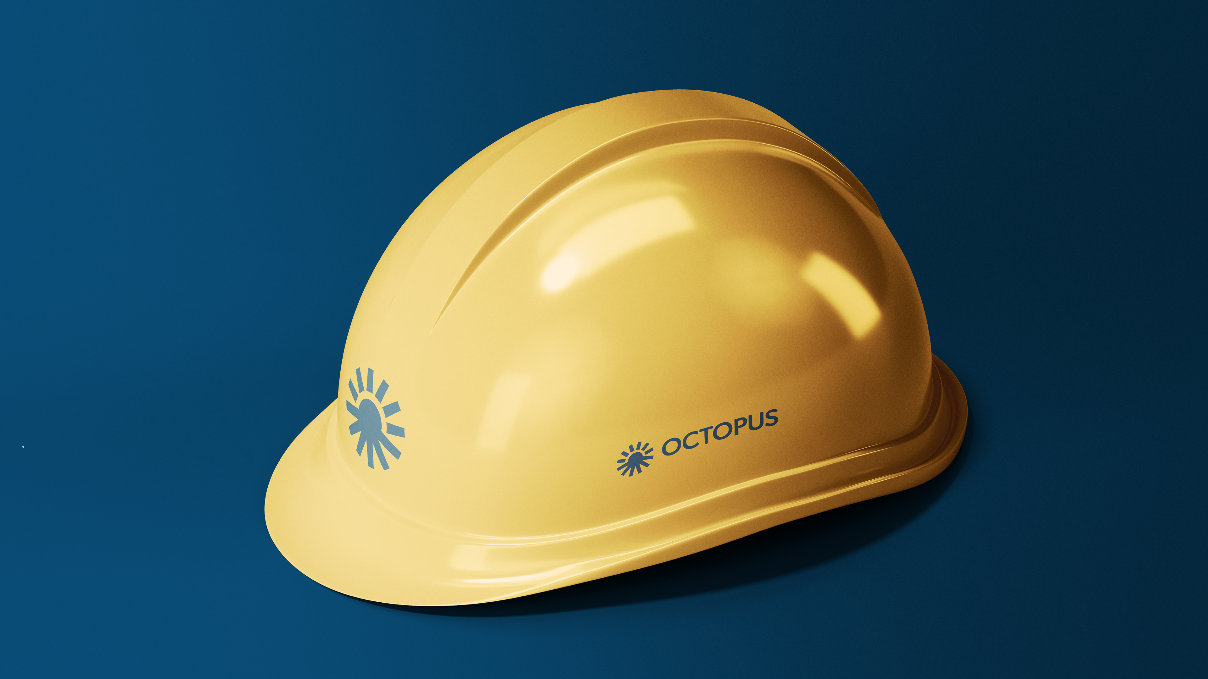
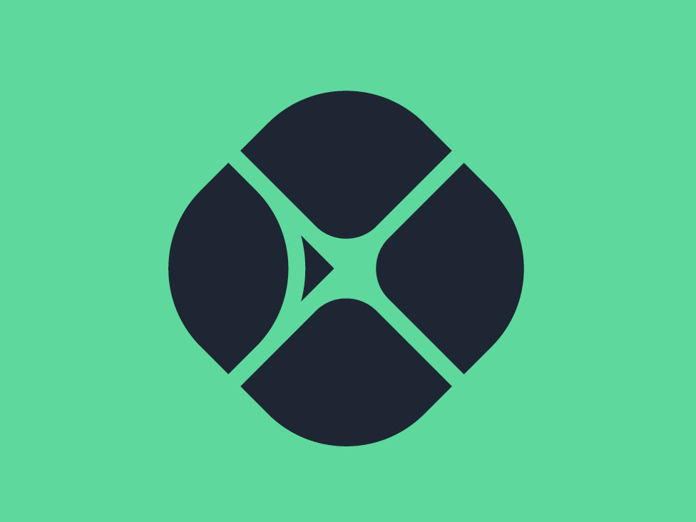
Logo design for project called OCTOPUS (how to acceleraTe local energy transition by supporting municipal authorities). OCTOPUS is a collaboration between 6 regions across Europe with diverse energy planning contexts. It aims to accelerate regional energy and climate plans, helping these regions achieve their climate goals.
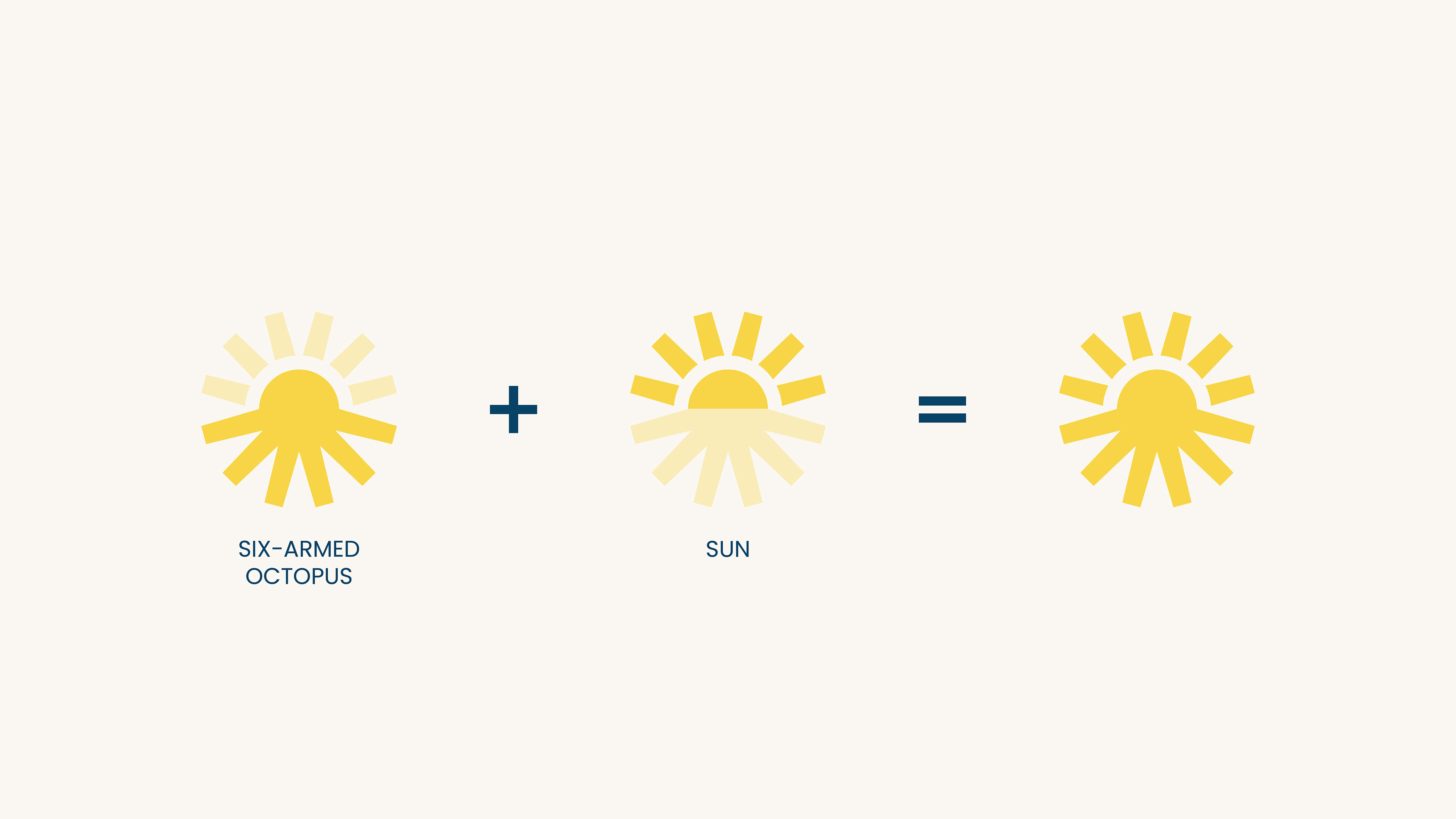
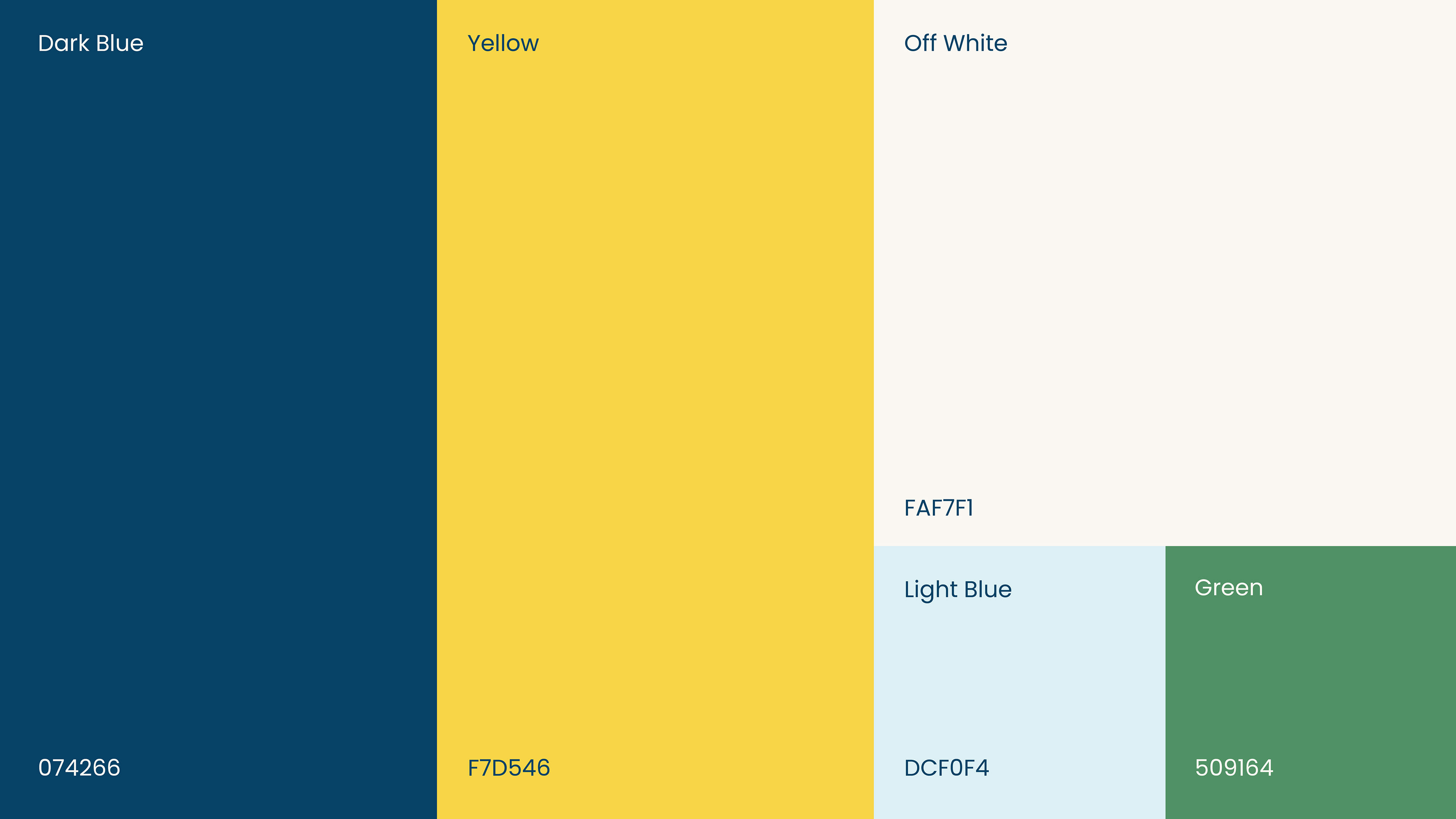
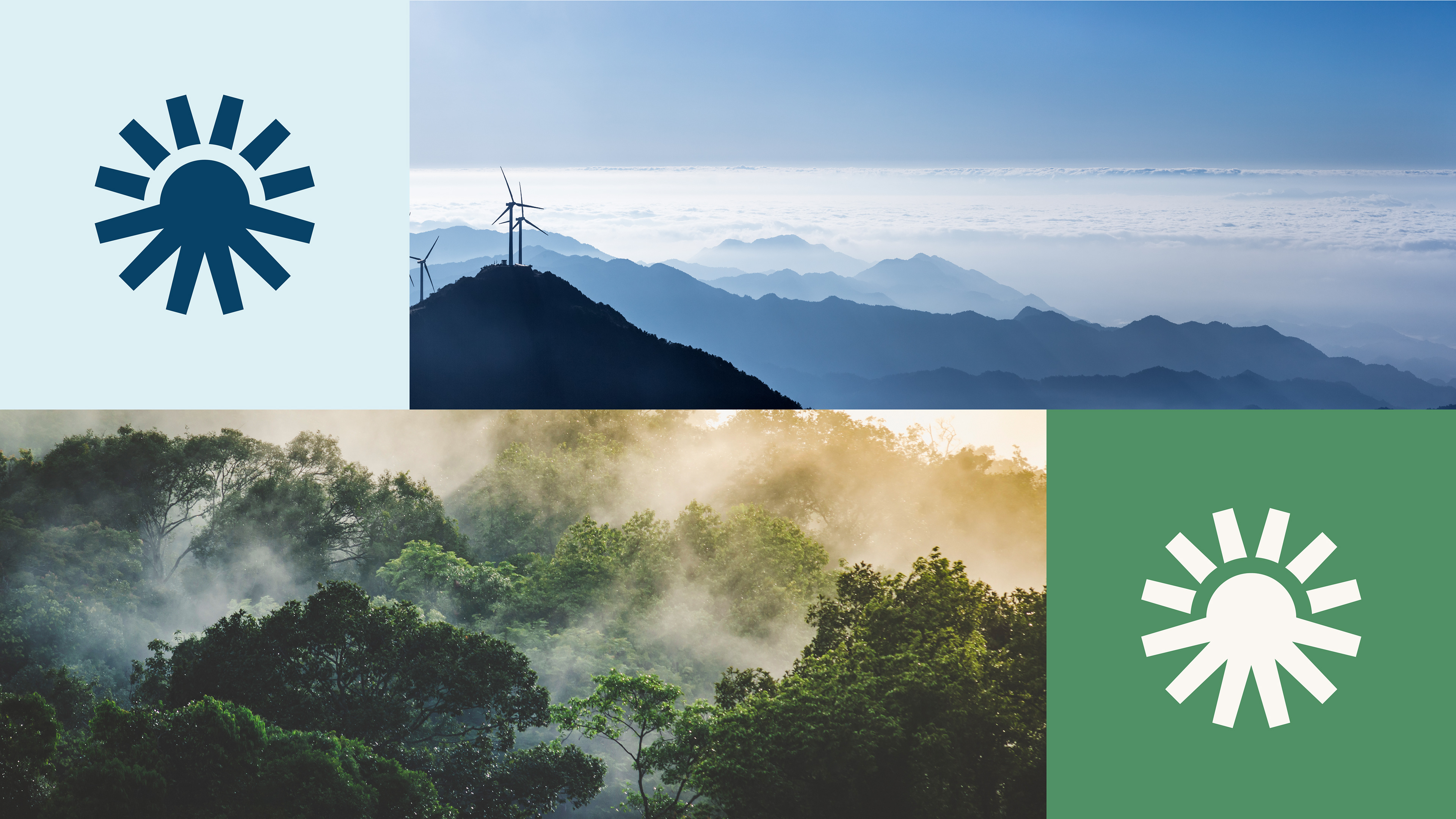
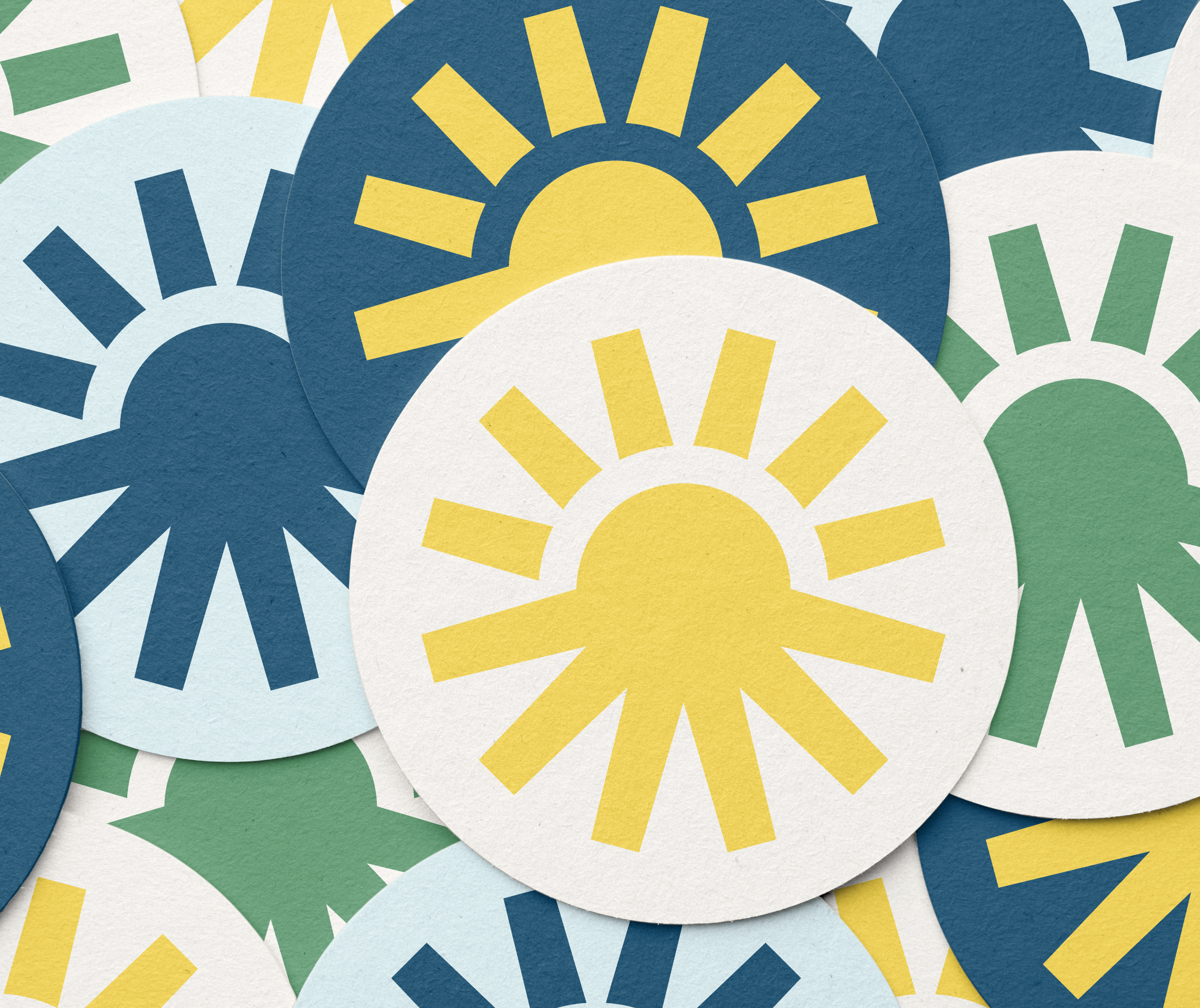
The design merges a sun shape with the six limbs of an octopus, symbolizing sustainable energy, collaboration and the six participating regions. The color palette drawn from nature emphasizing sustainability and harmony with the environment.
The design merges a sun shape with the six limbs of an octopus, symbolizing sustainable energy, collaboration and the six participating regions. The color palette drawn from nature emphasizing sustainability and harmony with the environment.